Thursday, September 29, 2011

Toward a Sense of Place

Part of life's journey for many of us seems to be about finding a sense of place. Whether it is a physical place or a symbological one that we seek, the call to find a place where we feel just right is strong. I have always been a Goldilocks, my life littered with chairs both too big and too small. It is the search for that sense of just-right space that propels a great deal of my work. Certainly this is true of my latest altered book project, which I call The Spectator. What follows are seven photos of two spreads from that book. Both are interactive spreads, containing  moving elements. In designing these pages, I was expressing what my sense of place might look like; in creating the interactive elements, my aim was to pull in the reader and have him or her stay awhile...in my space.

This is an overview of the sixth spread.
 (Xylene transfer/acetate, papers old and new, ribbon, Japanese masking tape,
 dye inks, acrylics, markers, button, metal tape, paper mesh)

Lifting the paper mesh reveals the door.
 (Xylene transfer/acetate, text snips, markers, baker's string, ribbon, Japanese masking
 tape, hardware, dye inks, acrylics, clock, charm, fabric, old nail for door bolt)
After opening the doors there is a tip-in page.
 (Tip-in page made from old postcard. Old paper, acetate, baker's
string, dye inks, acrylics, metal tape, nail)
After turning the tip-in page.
(Fancy paper, Japanese masking tape, gel transfer image, dye inks, acrylics, baker's string, papers,
 text snip: "no matter how thin you slice it, it's always baloney.")
The tenth spread contains a tip-in page and a flap. This is the tip-in.
(Papers from old books and magazines, acetate, dye inks, acrylics, masking tape, cardboard tip-in page)
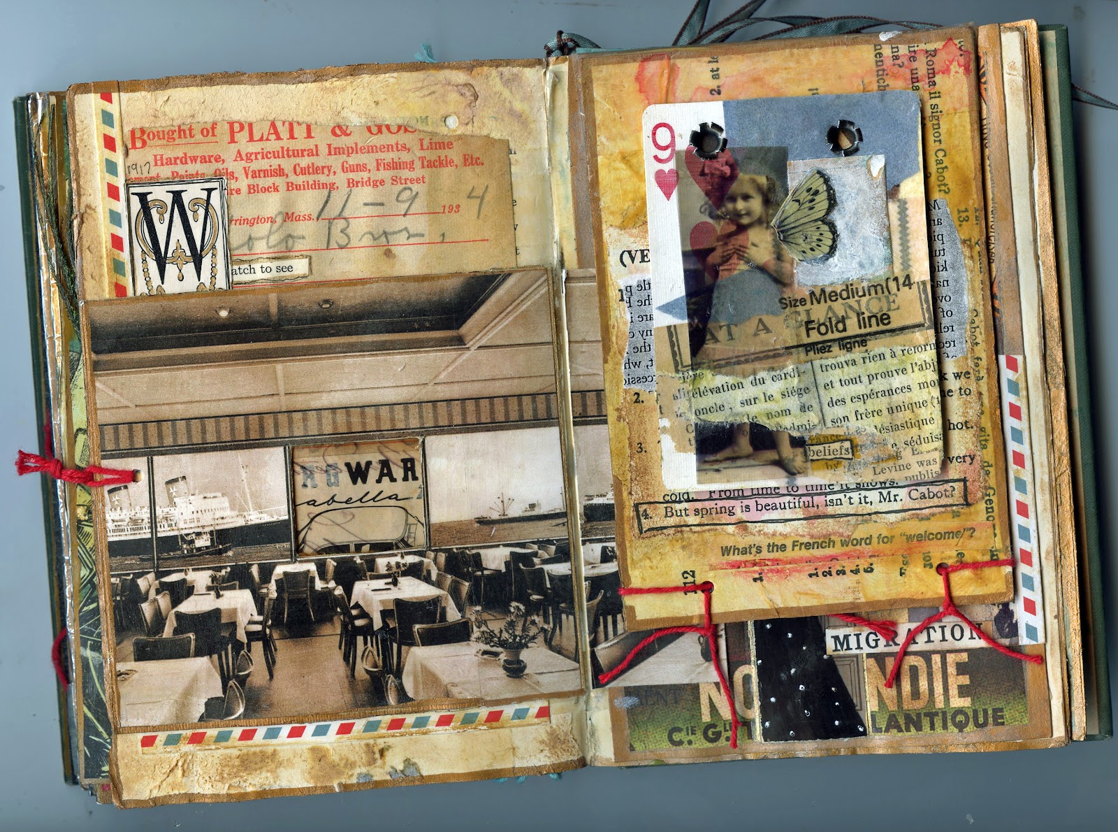
After turning the tip-in page.
(Old postcards, playing card, dye inks, acrylics, various papers, baker's string, acetate) 
After lifting up the flap.
(New and old papers, masking tape, photo prints, dye ink, resin, sheet music) 

In my travels both near and far, I have come to find myself seeking out places that seem to have within them a sacred grounding. This may be something as casual as a well-pruned apple orchard against an agrarian skyline or something as magnificent as the environmental sculpture Opus 40, in Saugerties, NY. Built by sculptor Harvey Fite with hand tools and local bluestone, Opus 40 took 37 years to complete. If you are anywhere near the Saugerties area, this landmark is well worth a visit.
Approaching Opus 40.
Inside the sculpture 
As always, thanks for listening.

Saturday, September 17, 2011

A Life of It's Own

Never trust your scraps. They march across your workspace and jump onto your canvas. This piece was headed somewhere else (described in a previous blog: "The Various Messages of Scraps"),  when words from a 1946 copy of The Grade Teacher muscled their way aboard. The focus turned with the zest of an old Pinto with rack-and-pinion steering.

The Egg-Handlers, mixed media on 8x10 canvas board, September 2011
Source paper: Birds of America (1913), Progressive Tailor Magazine (1926), The Grade Teachers (1946)
Photo print courtesy of Mrs. Inman
This project has grown and now there is a series of three other pieces underway. Using various transfer techniques, stenciling, and prints of the original photo, I find myself enchanted with all that can be expressed by the image of this faceless woman. And I do so love her hat....

Thanks for listening.

Saturday, September 10, 2011

The Various Messages of Scraps

I'm almost finished with a collage called "Subjectively Yours," but it needs something to balance the relationship between the blue ghost lady and the cool lady in the jodphurs.


I tried a few scraps hanging around on my table, to get an idea of what would and wouldn't work. Clearly everything one adds to a collage will have some sort of visual meaning, but certain scraps can bring a strong literal impact as well. For example, birds. Ubiquitous creatures, birds. But some more than others. This particular heron is a clip from a piece of gorgeous Japanese paper, and clearly is not at home in what has shaped up to be a rather Southwestern color pallette.


The next candidate is a seat stub from a recent train ride. That blue is stylin'! But both the numbers and the days-of-the-week boxes, even if cut up and separated, would push the composition in what I can only call an actuarial direction. This would take away some of the soft dreaminess of the piece.


I've never met a map I didn't like, but once again, maps bring strong associations to a work. And while there can be journeys even in the smallest of steps, I feel that adding a piece of this map (which comes from a tiny book of French maps), would push the meaning of the work beyond the intimate. And I want the focus to stay on the intimate.


Next up is a stamp from an old collector's guide to postage stamps. Postage stamps, like maps, are iconic. I'm drawn to this stamp because of the bird-hunting text, and my ladies could definitely be hunting eggs. But it's the wrong typeface, the wrong color, and the wrong shape. Still it makes me think about adding more text to this piece.


But when I think of text that I might want to add, I realize that I have said everything that I want to say. Anything else would be overload. I also realize that the text at the top, which I made with an acetone transfer, is way too small for the role I want it to play. And there it is. All of I sudden I know what I have to do. I will make a tape transfer of that big "Subjectively Yours" text strip and then adhere it somewhere in the top two-thirds of the piece. Because the text strip will be transparent, I am hoping the words will look like an echo.  


I'll post the result. Thanks for listening.

Monday, September 5, 2011

The Watermelon Party


Labor Day signals the end of summer,
 time to put away the white shoes and purses, as my mother would say.
Bring on the new notebooks and pencils,
crisp weather, winter squash, leaf storms.

The Watermelon Party, hand collage on canvas board

But when those winter winds are whistling, I know that I will miss
the sweetness of summer running down my chin.
Happy Labor Day.


Thursday, September 1, 2011

Altered Playing Cards II

"Seeing, Hearing," 8-2011
I've been fooling around with ways to better integrate the face markings of the playing cards with what I'm trying to say with the designs. These cards are some examples of where I'm going. Hope you enjoy, and thanks for listening.

"In Spades," 8-2011
"Lavender," 8-2011
"The Young Women," 8-2011
"Critical Mass," 8-2011
Related Posts Plugin for WordPress, Blogger...