But often that risk is well worth taking, and I wish more of us (including me) would do it more of the time. If you follow my writings, you know I love telling stories backwards (if not in high heels like Ginger Rogers), so let me stay true to form and begin with where I ended up.
Which is here, the updated version of one of my recent works.
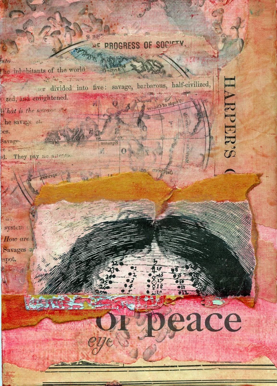 |
| "Savages," Laura Tringali Holmes 2012 (updated) Collage/decollage of paper and mixed-media on 5 x 7 canvas board In-place acrylic gel transfers and acrylic glazes; old papers featuring Harper's Monthly 1886, McCalls Magazine 1930, Mitchell's New Intermediate Geography of Pennsylvania 1892, and postal ephemera. |
I posted an earlier version of this work--without the acrylic glazework--about a week ago in my gallery at http://lauratringaliholmes.deviantart.com. The deviantArt website is one that encourages conversation (as opposed to the more microbloggery-based venues of Flickr and Tumblr), and one of my art colleagues commented that it would be nice to see "a subtle glaze of color over the entire piece." My colleague went on to suggest that I use "a similar yellow as the yellow around the scalp or some subtle red as it is often associated with savagery." I had to laugh when my colleague added that the red might be too much...he advised me to try out a few options on copies before settling on the path I wanted to travel. The reason for my laughter? The guy talking to me is what I consider a master glazeworker and could have easily pulled off precisely the proper red. In seconds flat. Me? Not so much.
Flash back to my last week and you will see me breaking through my own color barriers with help from little bottles of Van Dyke brown, yellow ochre, burnt sienna, pyrrole red, cadium red, and naphtohl red, with side trips into various greens and blues for balance and the discovery of an especially delicious premixed glaze called "seafoam green." Sorry to wax rhapsodic, but I am proud of my explorations and pretty darn happy with my final result.
This is the first version of the piece, which I liked at first, but it turned out that it couldn't bear with close scrutiny:
 |
| "Savages," Laura Tringali Holmes 2012 (first version) Details the same as above, without the acrylic glazework |
Where I wound up with the revised version is just so much closer to what I wanted to express in the first place. I feel really good about that. I admit I could not manage to make the red in my mind appear on the canvas board, but I got pretty close. That's good enough for me for now.
Beyond the piece under discussion, there's happened an unexpected bonus of larger proportions. I've rekindled my (lapsed) love of paint and have been enjoying a productive time incorporating glazes into a variety of a few works-in-progess, as you can see in the following photo, taken with my trusty cell phone...at the end of a very long Friday.
 |
| A variety of works in progress, inspired by my glazing conversations with artist Seth Fitts. |
And now for the gratitude. For all of this personal positive movement forward, I have artist Seth Fitts to thank. Do you know his work? If you don't, you might want to take a look. Seth's work is subtle but stirring. It doesn't try to beat you over the head, even though it's sometimes risky within its visual vocabulary. It doesn't ever pander, and seems always brutally honest, but there are usually top notes of light-heartedness and humor. The finish is luxurious--you want to keep looking. There's no hidden agenda. This guy is first class all the way.
Oh, yeah, Seth Fitts is a master of technique, but it's not in a vacuum. When I think of technique in service to concept, I think of Seth.
You can treat yourself to a tour of Seth Fitt's exquisite gallery here: http://sethfitts.deviantart.com/gallery/
Thanks to Seth for enriching my perspective, and thanks, as always, to all who read this for tuning in.

6 comments:
How interesting! I love to hear about process. Your work is very interesting and i like looking at it and reading about how it came to be. I'll be sure to take a look at Seth's work too. Thanks.
Thanks! Still experimenting with glazing...ruined a few canvases in the process though. Oh well! Into the recycle bin!
My over-layers of choice are beeswax, teabag paper or gesso in any or all combinations. I have never experimented with glaze. I like the effect. I think an overlay of any kind give a cohesiveness to collage. Otherwise collage is not much different than a "me poster" from Oprah.
Kimmie! What the heck is a "me poster"? We have a TV but I haven't watched it since the last presidential election, and it is down in the back of the basement where the crickets come in when it's too hot outside. Of course I know who Oprah is, though! I like the sound of a Me Poster. Sounds kind of empowering!
What a difference! More depth and interest. Very brave of you to glaze it over!
Seth Fitt's work is wonderful for sure.
Yeah, Carole, it was quite the nervous-making activity. And while it's still not right, the work definitely pointed me in the right direction.
Post a Comment