Friday, August 24, 2012

Glazing Over

I love participating in the art of artistic interaction, and it is an art. I'm not talking about how many times one can use the word "amazing" in a paragraph when giving feedback on a work of visual art, but rather the thoughtful communication of authentic commentary. Of course this type of communication takes some skill. Who wants the person on the other end of the line, after all, to drop everything in order to draw up his or her arms and legs into the fetal position? Saying the wrong thing at the wrong time is always a big risk, isn't it?

But often that risk is well worth taking, and I wish more of us (including me) would do it more of the time. If you follow my writings, you know I love telling stories backwards (if not in high heels like Ginger Rogers), so let me stay true to form and begin with where I ended up.

Which is here, the updated version of one of my recent works.


"Savages," Laura Tringali Holmes 2012 (updated)
 Collage/decollage of paper and mixed-media on 5 x 7 canvas board
 In-place acrylic gel transfers and acrylic glazes; old papers featuring Harper's Monthly 1886,
McCalls Magazine 1930, Mitchell's New Intermediate Geography of  Pennsylvania 1892,
and postal ephemera.


I posted an earlier version of this work--without the acrylic glazework--about a week ago in my gallery at http://lauratringaliholmes.deviantart.com. The deviantArt website is one that encourages conversation (as opposed to the more microbloggery-based venues of Flickr and Tumblr), and one of my art colleagues commented that it would be nice to see "a subtle glaze of color over the entire piece." My colleague went on to suggest that I use "a similar yellow as the yellow around the scalp or some subtle red as it is often associated with savagery." I had to laugh when my colleague added that the red might be too much...he advised me to try out a few options on copies before settling on the path I wanted to travel. The reason for my laughter? The guy talking to me is what I consider a master glazeworker and could have easily pulled off precisely the proper red. In seconds flat. Me? Not so much.

Flash back to my last week and you will see me breaking through my own color barriers with help from little bottles of Van Dyke brown, yellow ochre, burnt sienna, pyrrole red, cadium red, and naphtohl red, with side trips into various greens and blues for balance and the discovery of an especially delicious premixed glaze called "seafoam green." Sorry to wax rhapsodic, but I am proud of my explorations and pretty darn happy with my final result.

This is the first version of the piece, which I liked at first, but it turned out that it couldn't bear with close scrutiny:

"Savages," Laura Tringali Holmes 2012 (first version)
Details the same as above, without the acrylic glazework


Where I wound up with the revised version is just so much closer to what I wanted to express in the first place. I feel really good about that. I admit I could not manage to make the red in my mind appear on the canvas board, but I got pretty close. That's good enough for me for now.

Beyond the piece under discussion, there's happened an unexpected bonus of larger proportions. I've rekindled my (lapsed) love of paint and have been enjoying a productive time incorporating glazes into a variety of a few works-in-progess, as you can see in the following photo, taken with my trusty cell phone...at the end of a very long Friday.

A variety of works in progress, inspired by my glazing conversations with artist Seth Fitts.


And now for the gratitude. For all of this personal positive movement forward, I have artist Seth Fitts to thank. Do you know his work? If you don't, you might want to take a look. Seth's work is subtle but stirring. It doesn't try to beat you over the head, even though it's sometimes risky within its visual vocabulary. It doesn't ever pander, and seems always brutally honest, but there are usually top notes of light-heartedness and humor. The finish is luxurious--you want to keep looking. There's no hidden agenda. This guy is first class all the way.

Oh, yeah, Seth Fitts is a master of technique, but it's not in a vacuum. When I think of technique in service to concept, I think of Seth.

You can treat yourself to a tour of Seth Fitt's exquisite gallery here:  http://sethfitts.deviantart.com/gallery/

Thanks to Seth for enriching my perspective, and thanks, as always, to all who read this for tuning in.

Saturday, August 11, 2012

How to Make a Gel Transfer

"Wild Honeys," Laura Tringali Holmes
Paper collage with mixed media on 5 x 7 canvas board.  Three gel transfers, papers from Les
 Journal des Demoiselles 1837 and various other old publications, handmade paper and fibers, dye
 inks, acrylic glazes, Micron pen, and one wine spill

It is hard to amuse even oneself when writing about how to make a gel transfer, but sometimes one must do what one must do, and I have promised a tutorial. So here goes. I have started with a photo, above, to demonstrate that the results are a whole lot groovier than the process. Making your own transfers is worth doing if you want to communicate feelings of mystery or emotional tension, history or time passing, in your work.

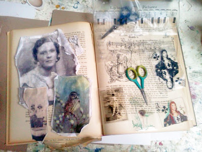
This next photo provides a brief vocabulary lesson on the transparencies I most often use. It's important to note at this point that while all transfers are transparent to some extent, not all transparencies are transfers. I can't count all the people I have managed to confuse by swinging between the terms while chattering about my work.


Everything to the left is a gel transfer. They don't look transparent, but they become semi-so
when you glue  them down. As for the transparencies on the right, the sheet music at the top is a
packing-tape transfer, as is the black-and-white playing card. The sepia-tone woman, plant,
and color playing card are acetate transparencies, not transfers.

You can make gel transfers from black-and-white or color images. Whichever you choose, this will involve photocopying. What you're going to be doing with the gel is slapping it on, letting it dry, and then rubbing off the photocopy paper leaving the ink behind. So no original images please. I'm using a black-and-white photocopy for this tutorial.

You'll get the best black-and-white transfers from an inky photocopy. Inky photocopies come from machines that use toner cartridges. Machines that are not on the cutting edge of technology tend to produce the best photocopies for making black-and-white gel transfers. Give the machine in your public library a try. Sadly, your library is probbly underfunded and making do with an old photocopy machine. Happily, that machine just might produce exactly what you need to make a decent black-and-white gel transfer.


This is an inky black-and-white photocopy.  You might want to start with a
smaller image than I did if you're just getting started with gel transfers.


Going to the library to make the photocopy might be the most exciting part of this process, although there is peace to be found in the repetition of laying down numerous coats of gel and watching them dry. You're looking to build up at least three coats if using a gloss gel, more if using a matte gel. I prefer using a soft gloss gel because it results in the most transparent image, but regular gloss gel provides a sturdier transfer. You can either slop the gel on or go for thin coats. But whatever you do, make sure each coat is thoroughly dry before adding another. You are going to be rubbing the paper off the dried gel down the line, so it's in your best interest to create sturdy layerings.

This is the first coat but it might as well be the second or third. There's
not a whole lot going on visually in this process. And while I like
Golden products, of course you can use other brands successfully. 


Sometimes when I work I like things really flat. Other times I like to create texture, as in the piece at the top of this page. Viewers engage differently with things that are smooth than they do with things that are bumpy. It's a nice detail to be in control of. This is something to keep in mind when brushing out the gel. Do you want ridges or smoothness?


As you can see, I'm leaving the ridges in the second coat. If you use a
matte gel, you won't have the option for big ridges, as it doesn't hold
brush strokes like gloss gel.


After your photocopy is coated, you want to throw it in water and go do something else for at least fifteen minutes. I left a gel transfer in a pot of water for two days once, and it was just fine, so you don't really have to rush back.

Soaking in water.

Now it's time to strip the paper off the back of your built-up gel. The water will have softened the paper, making this much easier than it may sound. A large transfer, like this one, can be unwieldy, expecially if you are hoping to keep it in one piece. If your transfer is large, try supporting it on your wrists. But whether you are working small or large, start rubbing off the paper in the middle of the image, with your thumbs. Like so.

My other thumb should be in the picture, but it's holding the camera.
Notice how the paper is coming off in rolls. That's what you're going for.
Now imagine how those rolls of paper can clog up your sink. Do not do
this directly over your drain!

And here we have it. The finished gel transfer will become semi-transparent after you glue it in place. There will always be some paper fuzz on the back of the transfer, so don't go crazy about that. The best way to neutralize the light-blocking tendency of the paper fuzz is to rub it with some more gel just before you glue it in place. That's rubbed-off paper in the sink strainer and some lemonade with strawberries for me.


And now, at last, an opportunity for wit! One of my favorite altered playing cards using a gel transfer.

"Bird With Heart," Laura Tringali Holmes
Altered playing card with paper collage and mixed media, using bird engraving and gel transfer,
various papers, text snippet, inks, paints, and glazes


Good luck! And thanks, as always, for tuning in.
Related Posts Plugin for WordPress, Blogger...