Wednesday, February 29, 2012

A Most Exquisite Corpse

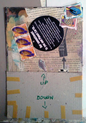
I've been working on an Exquisite Corpse collaboration with collage artist Adrian Jugaru of Romania (http://jugadi.deviantart.com), and if that doesn't bring on performance anxiety, I don't know what will. For those who don't know, an Exquisite Corpse is a collaborative piece of work where the preceding person's work is covered up except for by about an inch before it goes to the next person. That means you're creating a poem or a collage or a whatever from a very narrow margin. And you're not allowed to peek under the covering attached by the previous person. What fun would that be? Adrian and I each began a collage for the other, and we agreed that we should prepare the entire background before sending. This would give the other a feel for the vibe of the piece as well as color clues. The collage shown here is the one prepared by Adrian and finished by me.


See that pencil line in the photo above? That marks the top inch of Adrian's collage. I started my work in that inch, adding color and the arrow and box to the top of the hat shape provided by Adrian.


This overview shows the cover that Adrian taped on the collage (the collage measures 6-1/2 x 9-3/4 in.). Since I decided to continue with Adrian's “fishy” theme, I figured some fish stamps from South Africa and a recycled tag might come in handy.


The shot above shows how things looked after playing around with various arrangements and then gluing down the pieces.


I didn't know what was under the cardboard (I didn't peek, I promise!), but I did know that I wanted to send down some blue streaks, if nothing more than to make sure there was some unity between the sections of the collage. So I watered down some ink and, by flexing the cardboard and shaking the collage, was able to get some dripping action going. Because the ink is transparent, I figured it wouldn't obliterate anything that Adrian had glued beneath. I don't know if this broke Exquisite Corpse protocol, but I wound up dripping ink in three places.


And then it was done and it was time for the moment of truth!


When I saw this I was absolutely delighted! What fun! What serendiptiy! I loved how my verticals just so happened to complement Adrian's sword. I loved how the bird mask on Adrian's man worked with my theme of a predatory earth. (That big black tag is the earth, folks!) And I loved the watery ink drips.

Here is the finished piece. If you ever have occasion to participate in an Exquisite Corpse project, I say go for it! It's nerve-wracking to be sure, but there is something entirely magical in the moment when you reveal what lies waiting just beneath the surface.


And, again, as always, thanks for listening.

Sunday, February 19, 2012

Hauling in the Horizon

This is (probably) the last in my series of 8 x 10 ladies. I've (exhaustively) explored the subject, and it's feeling good to close one door and to open another.

La Graffita, paper collage on 8 x 10 canvas board using gel transfers and mixed media

The "graffiti" on the wall in this piece is made from a (seemingly) endless parade of direct-to-canvas gel transfers using pieces of text that I tore from a variety of advertisements published in 1930s McCalls and Farmer's Wife magazines. Direct gel image transfers can be challenging for the faint of heart (the end result is almost always a surprise), and the impatient (the drying time for the ink to thoroughly set in the gel can take upwards of an hour). Being neither faint of heart nor patient, I wound up working with drying times of (maybe) 5 to 10 minutes. But the varying broken textures of the transfers suited my purpose quite well, which was to create the impression of graffiti more as graphic element than reading material. Since the direct gel-transfer method reverses the images being transferred, this also worked to support my concept.

Still, because I am literally inclined, I have left a trap door for others of my ilk. So to read the text, one must only hold the work up to a mirror and all will be revealed. My favorite text snip happens to be the line on the right side of the graffiti wall that says "double f."

This works particularly well with my alternate title for this piece, which is “Rescue Me From Your Personal Heresies."

Here are the other pieces in the 8 x 10 ladies series.

The Egg Handlers, paper collage with mixed media on 8 x 10 canvas board.
House on the Hill 1, paper collage on 8 x 10 canvas board with mixed media

House on the Hill 2, paper collage on 8 x 10 canvas board with mixed media

Just Draw, paper collage on 8 x 10 canvas board with mixed media

As always, thanks for listening.

Thursday, February 2, 2012

Perceived Perceptions

I finished this piece a few days ago. The red dots were critical to me...a last touch, a grammatical ellipsis as well as a visual connection between a text snip about absence and a fragment of a poem mentioning a "dark week."  I was working to connect the two, bolstered, I thought, by the image of poor Bambi, who certainly had his work cut out for him surviving in Disney's fearsome forest, and that big "I" by the television knobs. I was expressing emotions involving escape by a very narrow margin, something I happen to know a great deal about.


"Oh Day Most Calm," paper on paper collage on 5 x 7 canvas board, January 2012
---
Paper sources:
Pathfinder magazine, 1928
Aus der Kindermelt, late 1800s or early 1900s
Phrase from Italian Made Simple, 1960
Icelandic children's magazine, 1968
Various ephemera from personal correspondence, travels, and friends

But those weren't the perceptions that were most widely perceived, at least according to the opinions of the viewers I've talked to on my gallery website. Most viewers experience a warmly nostalgic vibe when looking at this piece rather than the vibe of the quiet but triumphant escape from an oppressive situation that was in my heart and hands when I was putting this together.

Needless to say, I'm intrigued. I'm cogitating the notions of artistic success and failure as they relate to communicating emotions. I'm wondering if my original emotions really matter or if what really matters are the perceptions of viewers at the end point. I'm also studying the components of my design, trying to figure out where I could have stacked the deck more effectively to express my particular hand.

Every day brings more to learn, and I love that.
As always, many thanks for listening.

Related Posts Plugin for WordPress, Blogger...