Sunday, December 11, 2011

A Dangling Conversation

A long time ago, in the 1970s and 80s, there developed a rather lively conversation between those who practiced art and those who practiced artisanry, or craft. The conversation talked around the boundaries of each of those disciplines. What is art? What is craft? We'd crowd around wherever we could find a flat surface and discuss this every which way over endless meals and drinks. At one point, in the field of furniture design, an informal term was coined--art-iture--to describe furniture that was considered as sculptural as it was utile. Furniture such as shown in the book below. Visionary in nature, the book didn't tell you HOW to make a piece of furniture, but how to make the design decisions needed to create what you wanted to express in the process of the making.

Yes, that is my name, pre-Holmesian, at upper right. The book was published
in 1989 by The Taunton Press, and is, sadly, long out of print. 

From the book: "All American Make Up Mirror and Dressing Table," Paul Sasso (photo by Paul Sasso)
"Roadrunner Chair," Mark Hazel (photo by Seth Stem)


From the book: Table inspired by gems and architectural buttresses, Seth Stem
(photo by Gary Gilbert)

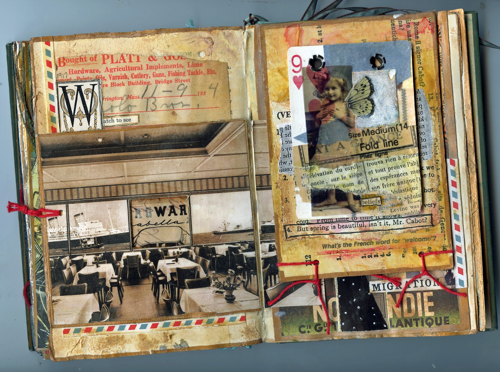
I feel an undercurrent of a similar conversation brewing today. What is art? What is craft? This time of year, especially, you'll hear it while browsing holiday markets. Your friend the photographer carping about the number of tables containing crocheted toilet-tissue holders and such like. Still, the discussion is rather more underground than in the past. In these days of enforced inclusivity, it's not exactly polite or politic to draw perimeters around anything.

I've made no secret of my feelings that, with few exceptions, the publishers and editors of the magazines and books of mixed media have dropped the visionary ball that once they carried. I do not subscribe to Somerset Studio (I do have an extensive collection of way-back-when issues), yet I occasionally flip through the pages at my bookstore, as I did several days ago. As always, the magazine was chock-a-block full of projects that mostly looked the same to my eye, but then...an interesting twist. Not long after a project on making gift wrap from dryer sheets appeared a breathtaking selection of works by Mary Beth Shaw. These were fascinating in composition, and oh, the color!

Reading through the article, a profile piece, it was revealed that Shaw had at one time read every book on color theory she could get her hands on. Aha!

When I got home from the bookstore, I took a look at the book review (not favorable) of Shaw's recent book that I had posted here on my blog (on the Book Reviews page http://lauratringaliholmes.blogspot.com/p/book-reviews.html ) and on Amazon. “Wouldn't it have been great,” I thought to myself, “if the editorial perspective of that book had been reframed to share Shaw's knowledge of and passion about color?”

Which got me to thinking. If that first book was from the artisan's approach, how awesome would be a book from the artist's insight.

To describe itself, Somerset Studio magazine uses, on its website, promotional language thus: “Paper crafting, art stamping and the lettering arts are elevated <italics and underlining mine> to an artistic level <italics and underlining mine> in Somerset Studio!”

"Elevated.” Hmmmm. "Artistic level." Interesting word choices there. What exactly do they mean? Somewhere, perhaps, there is indeed a conversation going on, and if not, I suspect there needs to be one begun.

Thanks for listening.


Friday, December 2, 2011

Pushing It

"Perfect 10," hand collage on playing card, Laura Tringali Holmes, 2011

When I decided to stop coloring my hair, my hair cutter advised a buzz cut, overdying, and a head-wrapping scarf to shield the world from my transition--in that order. I wasn't buying it, not one single bit. Eventually, after a bunch of back-and-forths, my hair cutter moved off polar opposite. We agreed to face the transition of brown to silver with flexibility and with the heart of a Columbus or Champlain. Ball in her court.

We didn't talk about it, but all of a sudden, a few layers were cut into my long hair--for "movement," my hair-cutter's theory being that movement was as good a disguise of transitioning as any.

A few weeks later, more layers, more "movement." I noticed that I could swing my hair to good effect. In motion, there is a beauty lacking in the static. I felt like a well-groomed collie. Silver on top, brown at the tips. I was surprised. My hair cutter smirked, like she had known the answer all along.

This, the woman who was one step short of draping me in a burka, to protect the eyes of society from poor, growing-out-of-hair-dye me.

Upon reflection, I realize that from the scarf to  the scissor artistry, this is a lesson in how we grow.

Suppose I had caved to the pressure of the scarf? Suppose my hair cutter had stuck to her preconceptions?

When we rise to challenges, we find stuff that we didn't even know we had. My hair cutter lifted her scissors in honor of the challenge. I rose to the challenge of letting her rise to the challenge.

In the continuum of life and experience, I realize that what bothers me when reading about other scissoring endeavors, such as "collage made easy," and that there are "no mistakes in collage," and that collage is a good way to "use up your leftovers," is the lack of progress upward.  

The easy way out would have put me in a scarf, or a buzz cut, or even more hair dye.

Why push for that when the options are so much more expansive?

As always, thanks for listening.

Monday, November 28, 2011

Me and You

"Just Draw," Laura Tringali Holmes, 2011
Hand collage with papers, acrylics, and inks, 8 x 10 on canvas board
Text and image snips from Progressive Tailor magazine, Grade Teacher magazine, 
Popular Science Monthly, and Birds of America

An award! Received by me! For up and coming bloggers! A designation I embrace with great happiness and pride. I speak of the Liebster Award, which recognizes and showcases rising bloggers with fewer than 200 followers. The origins of the award are German--the word “liebster” in German means “favorite” or “dearest.”

I received this award from Amy at Four Corners Design. When I first started blogging five months ago, one of my first finds was Amy's blog: http://fourcornersdesign.blogspot.com/ If you look at her header montage, there is a little snip of text that says “ substance from a solution.” Her creations—and her blog—are just that. Her work is pure invention, her tableux winsome, her photos enchanting. Yes. Definitely visit Amy.
In accepting the Liebster Award, participants agree to the following terms: 

1. Thank the awarder and link back to his or her blog.
2. Copy and paste the award to their blogs.
3. Choose five blogs to receive the Liebster Award and let these bloggers know by commenting on their blogs.

Here are my five blogs. The first four focus on art. The last on the list is the blog of a young woman who was diagnosed with Hodgkins Lymphoma a day after her 24th birthday. All of these blogs inspire me in all sorts of ways, and I am grateful for the internet community that makes this sort of communication possible. I hope you'll visit these bloggers and show them your support.
http://carolereidartist.blogspot.com/

http://lawendula.blogspot.com/


Wednesday, November 23, 2011

Women's Work

"New World Order," 5 x 7 hand collage, Laura Tringali Holmes, 2010.
Transfer techniques, vintage fairy-tale book, old photo,
old magazines, lace, dye inks

The danger in merchandising is that one must invariably compartmentalize things in order for buyers to understand them and...well...buy into the selling. We all start dancing around the narrow end of the funnel because it becomes what we understand. It becomes safe. Everybody starts doing it. Something that may have started out as an extraordinarily artistic risk, published by a far-seeing editor, over time self-neutralizes to reach the widest audience. Sadly, the path of least resistance can easily send us scurrying away from “other” because at the large mouth of the funnel, things are far less defined, far more uncomfortable, and even a little scary, especially if you've got a five-year book-publishing plan to structure or a year's worth of magazine content to get into the pipeline.

Not so long ago publishers adopted the genre of “women's fiction” (as distinguished from “women writers”) to market products that could easily be targeted to a specific set of buyers. As an interesting aside, you don't have to be a woman to write “women's fiction.” I wonder if "women's art” can be far behind “women's fiction.” More likely, I suspect it's already among us, the elephant in the middle of the living room, swallowed up under the catch-all heading of “mixed-media art.”

Certainly the majority of magazines and books dealing with mixed-media artwork exist in the maelstrom at the small end of the funnel—predictable, repetitious, focused in directions that seem to overvalue the heartfelt (even if slipshod) and the acquisition of technique for technique's sake. Design pops up now and then but hardly ever does it share a refreshing cup of tea and have an interesting tete-a-tete-a-tete with content and context. Oh the magic that can happen when these three get chatting! Creativity can veer off into a thousand million directions! And all of a sudden nothing looks exactly alike!

But that would put us at the large end of the funnel, wouldn't it, and that's not a place where people who sell stuff typically like to go.

As always, thanks for listening.

Sunday, November 13, 2011

Out and About


I'll be showing and selling here next weekend. If you're in the Hudson Valley area of New York, I'd love to see you!

Thursday, November 10, 2011

Slapdash Courage

I am by nature precise. In this age of frenetic spontaneity, I still sweat the details. In the little collage below, for example, the placement of that man's foot is not accidental. Nor is the placement of his hip. In the design of this piece, I was shooting to express the contrast of lift versus drag, to achieve a visual expression of the feeling of ascension that can come when listening to music that engages, charms, and uplifts.

“Man with Vim,” acetate photo transparency on playing card, old text,
sheet music, October 2011

So what's going on with the seemingly imprecise placement of that first line of text on the collage below? The heart can be a strong dictator. While my intellect was pushing for symmetrical placement, my heart was egging on my glue brush in its act of slapdash courage. Its argument? A placement of text blocks that oozed uncertainty would express the difficulty inherent in choosing to act with the courage of one's convictions. A difficult design decision to express difficult emotions.

“Woman with Fig Leaf,” acetate photo transparency on playing card,
old text, October 2011


As always, thanks for listening.

Sunday, October 16, 2011

Gone Fishing

Hitting the road, art journals in hand. Be back in a month. Thanks for listening.

"Fisherman's Daughter"
Hand collage with old postcard, text snips, and
photo transparencies.

Thursday, September 29, 2011

Toward a Sense of Place

Part of life's journey for many of us seems to be about finding a sense of place. Whether it is a physical place or a symbological one that we seek, the call to find a place where we feel just right is strong. I have always been a Goldilocks, my life littered with chairs both too big and too small. It is the search for that sense of just-right space that propels a great deal of my work. Certainly this is true of my latest altered book project, which I call The Spectator. What follows are seven photos of two spreads from that book. Both are interactive spreads, containing  moving elements. In designing these pages, I was expressing what my sense of place might look like; in creating the interactive elements, my aim was to pull in the reader and have him or her stay awhile...in my space.

This is an overview of the sixth spread.
 (Xylene transfer/acetate, papers old and new, ribbon, Japanese masking tape,
 dye inks, acrylics, markers, button, metal tape, paper mesh)

Lifting the paper mesh reveals the door.
 (Xylene transfer/acetate, text snips, markers, baker's string, ribbon, Japanese masking
 tape, hardware, dye inks, acrylics, clock, charm, fabric, old nail for door bolt)
After opening the doors there is a tip-in page.
 (Tip-in page made from old postcard. Old paper, acetate, baker's
string, dye inks, acrylics, metal tape, nail)
After turning the tip-in page.
(Fancy paper, Japanese masking tape, gel transfer image, dye inks, acrylics, baker's string, papers,
 text snip: "no matter how thin you slice it, it's always baloney.")
The tenth spread contains a tip-in page and a flap. This is the tip-in.
(Papers from old books and magazines, acetate, dye inks, acrylics, masking tape, cardboard tip-in page)
After turning the tip-in page.
(Old postcards, playing card, dye inks, acrylics, various papers, baker's string, acetate) 
After lifting up the flap.
(New and old papers, masking tape, photo prints, dye ink, resin, sheet music) 

In my travels both near and far, I have come to find myself seeking out places that seem to have within them a sacred grounding. This may be something as casual as a well-pruned apple orchard against an agrarian skyline or something as magnificent as the environmental sculpture Opus 40, in Saugerties, NY. Built by sculptor Harvey Fite with hand tools and local bluestone, Opus 40 took 37 years to complete. If you are anywhere near the Saugerties area, this landmark is well worth a visit.
Approaching Opus 40.
Inside the sculpture 
As always, thanks for listening.

Saturday, September 17, 2011

A Life of It's Own

Never trust your scraps. They march across your workspace and jump onto your canvas. This piece was headed somewhere else (described in a previous blog: "The Various Messages of Scraps"),  when words from a 1946 copy of The Grade Teacher muscled their way aboard. The focus turned with the zest of an old Pinto with rack-and-pinion steering.

The Egg-Handlers, mixed media on 8x10 canvas board, September 2011
Source paper: Birds of America (1913), Progressive Tailor Magazine (1926), The Grade Teachers (1946)
Photo print courtesy of Mrs. Inman
This project has grown and now there is a series of three other pieces underway. Using various transfer techniques, stenciling, and prints of the original photo, I find myself enchanted with all that can be expressed by the image of this faceless woman. And I do so love her hat....

Thanks for listening.

Saturday, September 10, 2011

The Various Messages of Scraps

I'm almost finished with a collage called "Subjectively Yours," but it needs something to balance the relationship between the blue ghost lady and the cool lady in the jodphurs.


I tried a few scraps hanging around on my table, to get an idea of what would and wouldn't work. Clearly everything one adds to a collage will have some sort of visual meaning, but certain scraps can bring a strong literal impact as well. For example, birds. Ubiquitous creatures, birds. But some more than others. This particular heron is a clip from a piece of gorgeous Japanese paper, and clearly is not at home in what has shaped up to be a rather Southwestern color pallette.


The next candidate is a seat stub from a recent train ride. That blue is stylin'! But both the numbers and the days-of-the-week boxes, even if cut up and separated, would push the composition in what I can only call an actuarial direction. This would take away some of the soft dreaminess of the piece.


I've never met a map I didn't like, but once again, maps bring strong associations to a work. And while there can be journeys even in the smallest of steps, I feel that adding a piece of this map (which comes from a tiny book of French maps), would push the meaning of the work beyond the intimate. And I want the focus to stay on the intimate.


Next up is a stamp from an old collector's guide to postage stamps. Postage stamps, like maps, are iconic. I'm drawn to this stamp because of the bird-hunting text, and my ladies could definitely be hunting eggs. But it's the wrong typeface, the wrong color, and the wrong shape. Still it makes me think about adding more text to this piece.


But when I think of text that I might want to add, I realize that I have said everything that I want to say. Anything else would be overload. I also realize that the text at the top, which I made with an acetone transfer, is way too small for the role I want it to play. And there it is. All of I sudden I know what I have to do. I will make a tape transfer of that big "Subjectively Yours" text strip and then adhere it somewhere in the top two-thirds of the piece. Because the text strip will be transparent, I am hoping the words will look like an echo.  


I'll post the result. Thanks for listening.

Monday, September 5, 2011

The Watermelon Party


Labor Day signals the end of summer,
 time to put away the white shoes and purses, as my mother would say.
Bring on the new notebooks and pencils,
crisp weather, winter squash, leaf storms.

The Watermelon Party, hand collage on canvas board

But when those winter winds are whistling, I know that I will miss
the sweetness of summer running down my chin.
Happy Labor Day.


Thursday, September 1, 2011

Altered Playing Cards II

"Seeing, Hearing," 8-2011
I've been fooling around with ways to better integrate the face markings of the playing cards with what I'm trying to say with the designs. These cards are some examples of where I'm going. Hope you enjoy, and thanks for listening.

"In Spades," 8-2011
"Lavender," 8-2011
"The Young Women," 8-2011
"Critical Mass," 8-2011

Friday, August 26, 2011

Grooving with the Glitch

I've been prepping a travel journal that I will take to Italy in a few months. It's turning out well. The papers that I'm using for background come from a 1960s schoolbook, Italian Made Simple, which I stumbled upon in a stack of free books at my local library. My theory is that as I work in my journal on the trip, I can refresh my (extremely limited) Italian language skills at the same time. Molto bene! I've also added solvent transfers to the pages, using maps and directions for walks I plan to take.

The journal is built on a Moleskin Japanese album (5 x 8.5), which has 48 folded zigzag pages.
That first page, way over on the left? Well, that would turn out to be the Glitch.

My design inspirations come from what I think Italy will feel like when I get there. Over the base prep I've been making patterns in thickly brushed gesso, then layering on glazes of phthalo turquoise (and various Madonna blues), yellow ochre, siennas raw and burnt, and burnt umber. Vintage European postcards and other materials from my various collections make handy lift-up trap doors and pockets for tags.

Here's a selection of prepped pages and tags. I've managed to stick to my predetermined
 color pallette for the most part. On most projects I wind up doing random color additions
that wind up looking awful. I'm steely about not doing that here, although hits
 of chartreuse and purple have managed to sneak in.
The bad news is that despite all my progress today, at day's end I find myself back at the beginning. My days' ends often work out like that, and I am learning that this is not necessarily a bad thing. For refreshment for the work ahead, I call upon a brooding Malbec.

There was no chianti in the wine rack, so I thought a brooding
Malbec would be a decent substitute.

My last task of the day is not to glory in the progress of my work but to detach the first page in the journal in order to add width. I am doing this because the first page won't even pretend to approach flat when opened, and I just can't stand that. So I slice apart the front page from its neighbor and in so doing liberate the entire page block from the book. I fold over some paper from the second page onto the first, make a new crease, and lay on a ton of packing tape for reinforcement. Geez, it looks awkward. Luckily, I remember that I have a couple of scalloped metal page edges in one of my bins. They prove to be workable and hide most of the packing tape. I'll use one metal edge on the first page, and, for balance, one on the last page.  I know that there will be physical and design repercussions from doing this.

The first repercussion is that the old Italian postcard of the Madonna now sits way too close to the gutter. I will have to rip out the postcard. Such are the dangers of working with original materials.

The metal page edges are made by 7 Gypsies and are nice and heavy—the page
 edge looks okay and as a bonus it weighs down the page to keep it open.

Because I used paper from the second page to widen the first page, another issue is the new narrow width of the second page. The metal edge draws attention to this. I see that I am going to have to lean heavily on the third page to balance out the second page. I fashion a tag holder and insert one of the tags I've already made. The visual weight helps a lot, plus the tag will give me more surface to write upon when I am in Italy.

The tag holder is made from the cover of a music book for voice (1948). It needs
 work but is good enough to give me the basic idea. I've barely sipped my wine, but before
tackling the Madonna, I definitely need a break.

Back to the Madonna. I realize that I actually like the rip in the postcard. Venice is sinking, frescos are deteriorating, we are marching toward the grave, Mother Earth is roaring--at least here on the East Coast of the United States--with an earthquake past and a hurricane future. A brooding glass of wine indeed! Yet I have the luxury of piecing together a Madonna. And for pure serendipity, there is the way the infant's feet point the eye to my little solvent-transfer line of text, the one that says, upside down of course (because that is sometimes the way I am), "introducing myself."

Still life with Madonna and Malbec
And that is what I did last night. Thanks for listening.

Thursday, August 18, 2011

With A Simple Change of Hats

There's nothing as potent as an act of creation to shift one's tectonic plates, to shake out a new perception or two from the old truth. I suspect that when people get into “a zone,” their brains forge brave new neurological pathways. And surely the personal defense network loses some of its force when one is on fire with focus. Not that I have been on fire with focus. On the contrary. I've been coping (or not) with that most difficult of adult transitions, the loss of a parent. Still, or maybe because of, there is capacity for movement forward.

As illustration, below you will find two pieces of work. One is a "before" and one is an "after." I collaged the "before" in June of this year (about two months after my mom was killed). I loved the old photo, and especially the lady on the left. I loved, and still love, how the lady looks into the camera, how she wears those long black gloves in a rowboat. When I first saw her, I wanted to sail her off into the sunset in fine style, as a sort of tribute to my mom. My goal was to conjure a flying-off-the-edge-of-the-earth feeling, and, in fact, as a design reference I used the Peter Pan attraction in Fantasyland at Disney World, a ride where one goes careening over London in a flying pirate ship.

I made an acetate transparency of the photo, back-papered the rowboat with assorted paper scraps, and developed light and color. At the end of the process, on a whim, I opened a brand new jar of tar gel (never used the stuff before, had scooped it off a clearance rack), and soon found that by whipping the gel really hard I could get ocean-spray-like bubbles, which I liked. (I also made plastic-looking swaths, which I didn't like, but that's a subject for another time.) At the last minute I gave the lady with the long gloves a whimsical yellow hat using paper cut from an old notebook. While I felt that the work had areas of disjointed composition, I didn't know what to do about it, so I called this piece done.
The BEFORE collage
 8x10 hand collage on canvas board
Photo courtesy of the collection of Mrs. Inman
Fast forward to just a few days ago—mid-August, two months after the original composition. I find myself in my workshop trying to scratch off that damn yellow hat. What the heck? It seems that I was having an allergic reaction. There was something about the whimsy of that hat that was really bothering me. And those gloves? I was having a problem with them, too. My mom, the copilot of my dad's sushi fishing enterprise, would never have seen the humor—or the statement—in wearing them, although in her youth, before children, I understand she was quite the fashion plate. And then there was this. The woman's direct gaze.

I can't remember the last time my mom looked at me like that. 

Clearly, some truth was trying really hard to get out.

And, as most truths will do, if we listen, this one eventually rose to the surface. 

And this is what I heard. The "before" collage is more about the mother who I wished I had than it is about the mother who I actually did have. This piece is not about my mom at all. It is about me. When I took breaks from digging at the the surface of the work with my fingernails, there emerged tantalizing bits and pieces of the truth, and I eventually realized that the disjointed elements I had come to criticize in the piece were a reflection of my own disjointed emotions, nothing more and nothing less.

But although I'm talking pain here--sadness and regret--I'm also talking epiphany, and that is where the "after" version of the collage comes in. If you hang around in your head long enough, I find, connections emerge, and in this case I realized that while the lady in the long gloves had nothing to do with my mother, she had everything to do with one of my daughters (who, coincidentally, is celebrating a birthday later this month). This daughter wears the photo lady's confident and determined gaze. This daughter values precision but delights in play and whimsy. This daughter is as comfortable on the ocean as she is on shore. This daughter, a born traveler, would as easily wear long black gloves as Thai fisherman's pants. Most important, this daughter, the girl born with maps in her bloodstream, wouldn't hesitate to board one of  Peter Pan's pirate ships for a careening voyage anywhere.

And so an imperative was born, and I challenged myself to redo the collage for my daughter's birthday. Which I did, reflecting not only my love for my daughter but the connection she shares with her grandmother, my mom. The hats were key here. I made them out of postage stamps, and the postage stamps at the bottom of the piece reflect not only the places to which my daughter has already travelled, but many of the places yet to be seen.

Past. Present. Future.

Here is the result. Thanks as always for listening.
The AFTER collage
"The Travelers"
 8 x 10 hand collage on canvas board
Featuring  many postage stamps

Friday, August 12, 2011

Watching the Woodpeckers Grow

Our deck rail continues to host fledgling groups of goldfinches, house finches, purple finches, tufted titmice, and sparrows. But the woodpeckers seem to be long done with child-rearing. Back in July, we were lucky, for the first time ever, to have a family of red-bellied woodpeckers bring its young to our house for fledge practice.


Here's one of the parents on the feeding ring. At first this parent was feeding its baby by beak, bringing food from the feeder to the fledgling.
That strange baffle on the feeder is my tin can squirrel-buster, held in place by packing tape.
With tinfoil smooshed into the front feeder points, it works well to thrwart our resident squirrels.
As you see, the desireable diners chow down at the back.

Here is the woodpecker fledgling, facing away from the feeder and into the viburnum bush. The parent would grab feed, hop into the bush, then hop out again to where the fledgling was parked on the deck rail, beak open, making food cries.


Here's the fledgling (or a sibling) again.


And here a fledgling has managed to make it to the feeder ring. First steps are hard! I love that face! The thing about baby birds is that they literally grow up before your eyes. One minute they're falling off the railing and the next they're flying comfortably along.You can see from the level of the feed in the feeder that time has elapsed between first lessons and this important step. Don't worry, there was still food to be had in the feeder—the level is just lower than the feeder collar, so you can't see it, a problem I rectified once traffic died down.


And in between bouts of birdwatching and reminiscing about my nest and the growth of my own three children, I had my nose deep in this, one of my favorite books ever. I would never rip this one up for collaging!
Translated from the German, 1959. If you love birds, this is well worth a read.
It's a page-turner about the "secret lives" of these shy and beautiful birds,
and contains incredible b/w photographs.

Once again, thanks for listening!

Thursday, August 4, 2011

The Altered Playing Card

Sometimes altered playing cards are just the thing. The small scale presents a million challenges, not the least of which is deciding how much of the playing card to reveal in the collage. How much of the card is too much, what amount is not enough?

This card takes the overkill approach and actually shows the faces of two playing cards. There's the regular old card on the bottom, and then, over that, an acetate transparency made from one of my deck of Cyrillic playing cards. The French text is from my 1837 copy of Journal des Demoiselles, a precious book lovingly featured in my last blog: http://lauratringaliholmes.blogspot.com/2011/07/letting-it-rip.html.
Queen of Clubs altered playing card, 2011
On the following playing card, I also featured card characteristics: the aces for a sort of two-thumbs up to the guy behind the wheel, and the "Bicycle" because it keeps that Queen song "Bicycle Race" looping in my head. Which at the moment is a good thing, although I can see it getting very bad very fast.
Lessons Learned the Hard Way altered playing card, 2011
(Wheel photo courtesy of the collection of Mrs. Inman)
This next card is about seeing. Since there are three sets of eyes, it felt right to me to leave in the two 3 symbols. I made sure they were dreamily floating in the starscape to anchor the corners, but didn't need them to do any more than that.  
Star Dust altered playing card, 2011
(Old photo courtesy of the collection of Mrs. Inman)
By contrast, in this piece the playing card symbology assumes a more important role. I needed the darkness of three of the four spades to balance out that honking big tin star.
To the Stars altered playing card, 2011
For a completely different approach, these two cards show nothing of the playing cards on which they were built. Early on in the process, I realized that I should have chosen Jacks or Jokers for these cards instead of the mundane numerics I did select. Once I got the Jacks  and Jokers in my mind, nothing else would do. I could have thrown out the cards and started afresh, but chose instead to seam in the pieces of the photos that I had originally cut off. These cards now remind me to take a breath and give myself a chance to let design ideas develop.
Turn Of a Phrase altered playing cards, 2011
(Photos courtesy of James Sorby)
If you enjoy altered playing cards, you will want to keep up with Liz Cohn at http://lizole.deviantart.com. Liz is currently gathering cards for a May 2012 show in Portland, Oregon, where over 150 hundred artists and well over 800 altered playing cards will be displayed. A large scale installation for small-scale works of art--how cool is that? Even cooler is that many (or most) of the cards are collaborations—sometimes involving three or four artists. Like angels dancing on the heads of pins, yes, it's amazing what can fit on a playing card. Here's a collaborative card that will be appearing in the show:
He's Such a Gas collaborative altered playing card, 2010
Liz Cohn, Audrey Smith,& Laura Tringali Holmes
Thanks for listening!
Related Posts Plugin for WordPress, Blogger...