Thursday, November 29, 2012

Prints of Collages: Animal, Vegetable, Mineral, Fish, Fowl, Other?

I've never been one for prints of my collaged work. I look at the prints and it's like they have sapped some of the spirit inherent in the original work. The Collage Factor goes way down in a print. Which makes sense, given that the prints are ... well ... prints. I wonder about prints of traditional collages. Are the prints animal? Vegetable? Mineral? I'm not sure what they are. Some sort of "other," probably, but neither fish nor fowl, if you ask me. But making a big print out of a small collage, as I did recently, certainly has tire-kicked my ruminative wheels into an approximation of a gear.

I made this big print at the request of one of my daughters and her college roommates. They wanted to display it on a wall in their apartment. It works well there, actually. (Yes, I checked.) I like the image just fine big, which I knew I would, but, geez, I find so much to hem and haw about in the details. Or lack thereof. I think that this must be a Traditional Collage Thing. When viewed as a print, the details go all paunchy. The shadowlines go fugitive. Cuts that might nettle a viewer's response in real life (such as the breast scarification in this piece), look merely bland, like a good nose job in Los Angeles. The décollage? When viewing the original it's clear that some fool rubbed off her fingerprints getting that texture just so and if one is lucky, the viewer may just be drawn in enough to ask why.  But you don't even see the décollage in a print. We won't even go into the color values....

My bottom line: A print of a traditionally made collage is like listening to My Morning Jacket in monaural format.

Tool Series: #1 Pink Cuff, paper collage with décollage on 6x8 canvas board, at left. Big-ass print on right.

Notice that I  deliberately have been inserting the descriptor "traditionally made" when I speak about my work. As usual, in these sorts of ruminative matters, there are tentacles that stretch out in many directions. Not everybody works "traditionally" anymore. In the collage community currently there is intriguing discussion on the parameters that define the medium of collage as we have known it. How much paper is enough paper? Should glue be measured by the pound? Is digital collage really "collage"? I read these discussions avidly, though I can't contribute much since I have only a primitive working relationship with digital media at the moment. But I can't help wondering if at some point the way you get there becomes less important than what you speak and what you spark.

In other words, if what you have to say happens to be best expressed through paper and glue and scissors and knives and even rubbing off your fingerprints in the spirit of décollage ... and what you create speaks to hearts enough to be requested for daily living with ... what the heck does it matter if the shadowlines look like they were made with thick Micron pens?

These are initial thoughts and I apologize for the lack of sophistication. Art is a journey. More to follow. Thanks for listening.

Sunday, November 11, 2012

Dirty Birds

"Dirty Bird #1," 2012. Laura Tringali Holmes. Paper collage with décollage
on 5 x 7 canvas board. Ink transfers from antique papers, mica splits, charcoal,
and beeswax finish. 

These four works form a series borne of weeks of listening to a large part of the Rufus Wainwright musical oeuvre. As you can see, my reaction to Wainwright's complex layering of sound and personal experience was a stanchless layering of paper in an attempt to construct a vignette of my own personal history. I call this series "Dirty Birds."

I relied heavily on the process of décollage to create this series. The word décollage comes from the French (décoller), meaning to unstick or take off. And that's just what I did. I layered a ton of paper. I then methodically removed most of it with my fingertips, leaving only traces of what had gone before. I used water to soften up the layers, sometimes spit, and coffee, too.

Rubbing off the new to reveal the old and vice versa. Building an intimate intersection of then and now. As Rufus Wainwright so masterfully does in his musical work.


"Dirty Bird #2," 2012. Laura Tringali Holmes. Paper collage with décollage
on 5 x 7 canvas board. Ink transfers from antique papers, mica splits, charcoal,
 and beeswax finish.

While décollage technically may be about rubbing off, for me, much of the process happens at the front end of the work, in the planning, when the ideas spark. What should survive the excavation? How best to assist the interaction of the paper layers both during the décollage process and in the finished work?

And what about color? In décollage, I have discovered, the luscious inks on antique paper will often transfer to the work even as you meticulously rub away its carrier pulp. There's a lot of controlled ink transfer going on in these pieces. This is stuff to think about in advance.


"Dirty Bird #3," 2012. Laura Tringali Holmes. Paper collage with décollage
on 5 x 7 canvas board. Ink transfers from antique papers, mica splits, charcoal,
 and beeswax finish.

While blithesome kick-up-your-heels serendipity is never to be denied, the workhorse for me in the creation of this series was care. And control. Again, a reflection of what I was hearing in my studio.

"Dirty Bird #4," 2012. Laura Tringali Holmes. Paper collage with décollage
on 5 x 7 canvas board. Ink transfers from antique papers, mica splits, charcoal, and beeswax finish.

Hope you enjoy the Dirty Birds.
---
A note to those who, like myself, care about such things: The prominent text snips in all four works come from Gloria Steinem's 1993 book, Revolution From Within, which was out the door in the library recycle pile when I happened to grab it back. Flipping idly through the pages, the book fell open to the story about Laura and the Confidence Clinic. My name is Laura. I've been working on confidence. A tip of the hat to serendipity, and there you have it.

Monday, September 3, 2012

Blind Perfectionist

"Blind Perfectionist," Laura Tringali Holmes 2012
---
Paper collage with décollage and in-place acrylic-gel transfers on 8 x 10 canvas board
with pencil and marker
 Papers: 1930s sales receipt; 1923 Speedwriting Shortland Dictionary; 1978 A Field Guide  to the Nests,
Eggs, and Nestlings of North American Birds; Irving Berlin Songbook; other papers 1800s - 1980s.
 
Many moons ago I was quite the perfectionist, but no more. Perfectionism is a righteous place in which to dwell. It's so utterly morally unshakeable. So judgmental. So paralyzing in its detail. So...blinding.

I changed up my ways thanks to an online housekeeping column, written by Marla Cilley, which I started to read when I sunk to the bottom of the barrel of overwhelment by the act of single-mothering three children.

Marla's advice was that it was better to take a lick at a snake than to sit there in paralysis and allow oneself to be bitten.

This piece is about taking a lick at the snake, and about the smoke and mirrors of the details of perfectionism.

Hope you enjoy. And thanks, as always, for listening.

p.s. In case you don't follow regularly, the "how to make a gel transfer" tutorial appears a few blogs ago, here: http://lauratringaliholmes.blogspot.com/2012/08/how-to-make-gel-transfer.html

Update September 5, 2012:

This collage, "Blind Perfectionist," was given a Daily Deviation Award on 9-5-2012 at the site where I keep my gallery (http://lauratringaliholmes.deviantart.com/). I've received a slew of favorable comments, including some from artists who typically don't much like collage. I feel great about the approval, but also great about turning people on to the boundlessly expressive medium that is collage.

This is what the site says about the Daily Deviation choice process:

"The Daily Deviation is a daily feature chosen from the galleries here on deviantART. A small assortment of submissions are chosen each day by a select group of staff/volunteer members who wish to showcase an image which they found impressive or otherwise interesting enough to deserve being brought to the attention of the community-at-large."

I am honored by the recognition and deeply grateful.


Friday, August 24, 2012

Glazing Over

I love participating in the art of artistic interaction, and it is an art. I'm not talking about how many times one can use the word "amazing" in a paragraph when giving feedback on a work of visual art, but rather the thoughtful communication of authentic commentary. Of course this type of communication takes some skill. Who wants the person on the other end of the line, after all, to drop everything in order to draw up his or her arms and legs into the fetal position? Saying the wrong thing at the wrong time is always a big risk, isn't it?

But often that risk is well worth taking, and I wish more of us (including me) would do it more of the time. If you follow my writings, you know I love telling stories backwards (if not in high heels like Ginger Rogers), so let me stay true to form and begin with where I ended up.

Which is here, the updated version of one of my recent works.


"Savages," Laura Tringali Holmes 2012 (updated)
 Collage/decollage of paper and mixed-media on 5 x 7 canvas board
 In-place acrylic gel transfers and acrylic glazes; old papers featuring Harper's Monthly 1886,
McCalls Magazine 1930, Mitchell's New Intermediate Geography of  Pennsylvania 1892,
and postal ephemera.


I posted an earlier version of this work--without the acrylic glazework--about a week ago in my gallery at http://lauratringaliholmes.deviantart.com. The deviantArt website is one that encourages conversation (as opposed to the more microbloggery-based venues of Flickr and Tumblr), and one of my art colleagues commented that it would be nice to see "a subtle glaze of color over the entire piece." My colleague went on to suggest that I use "a similar yellow as the yellow around the scalp or some subtle red as it is often associated with savagery." I had to laugh when my colleague added that the red might be too much...he advised me to try out a few options on copies before settling on the path I wanted to travel. The reason for my laughter? The guy talking to me is what I consider a master glazeworker and could have easily pulled off precisely the proper red. In seconds flat. Me? Not so much.

Flash back to my last week and you will see me breaking through my own color barriers with help from little bottles of Van Dyke brown, yellow ochre, burnt sienna, pyrrole red, cadium red, and naphtohl red, with side trips into various greens and blues for balance and the discovery of an especially delicious premixed glaze called "seafoam green." Sorry to wax rhapsodic, but I am proud of my explorations and pretty darn happy with my final result.

This is the first version of the piece, which I liked at first, but it turned out that it couldn't bear with close scrutiny:

"Savages," Laura Tringali Holmes 2012 (first version)
Details the same as above, without the acrylic glazework


Where I wound up with the revised version is just so much closer to what I wanted to express in the first place. I feel really good about that. I admit I could not manage to make the red in my mind appear on the canvas board, but I got pretty close. That's good enough for me for now.

Beyond the piece under discussion, there's happened an unexpected bonus of larger proportions. I've rekindled my (lapsed) love of paint and have been enjoying a productive time incorporating glazes into a variety of a few works-in-progess, as you can see in the following photo, taken with my trusty cell phone...at the end of a very long Friday.

A variety of works in progress, inspired by my glazing conversations with artist Seth Fitts.


And now for the gratitude. For all of this personal positive movement forward, I have artist Seth Fitts to thank. Do you know his work? If you don't, you might want to take a look. Seth's work is subtle but stirring. It doesn't try to beat you over the head, even though it's sometimes risky within its visual vocabulary. It doesn't ever pander, and seems always brutally honest, but there are usually top notes of light-heartedness and humor. The finish is luxurious--you want to keep looking. There's no hidden agenda. This guy is first class all the way.

Oh, yeah, Seth Fitts is a master of technique, but it's not in a vacuum. When I think of technique in service to concept, I think of Seth.

You can treat yourself to a tour of Seth Fitt's exquisite gallery here:  http://sethfitts.deviantart.com/gallery/

Thanks to Seth for enriching my perspective, and thanks, as always, to all who read this for tuning in.

Saturday, August 11, 2012

How to Make a Gel Transfer

"Wild Honeys," Laura Tringali Holmes
Paper collage with mixed media on 5 x 7 canvas board.  Three gel transfers, papers from Les
 Journal des Demoiselles 1837 and various other old publications, handmade paper and fibers, dye
 inks, acrylic glazes, Micron pen, and one wine spill

It is hard to amuse even oneself when writing about how to make a gel transfer, but sometimes one must do what one must do, and I have promised a tutorial. So here goes. I have started with a photo, above, to demonstrate that the results are a whole lot groovier than the process. Making your own transfers is worth doing if you want to communicate feelings of mystery or emotional tension, history or time passing, in your work.

This next photo provides a brief vocabulary lesson on the transparencies I most often use. It's important to note at this point that while all transfers are transparent to some extent, not all transparencies are transfers. I can't count all the people I have managed to confuse by swinging between the terms while chattering about my work.


Everything to the left is a gel transfer. They don't look transparent, but they become semi-so
when you glue  them down. As for the transparencies on the right, the sheet music at the top is a
packing-tape transfer, as is the black-and-white playing card. The sepia-tone woman, plant,
and color playing card are acetate transparencies, not transfers.

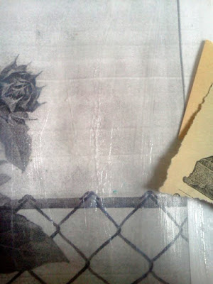
You can make gel transfers from black-and-white or color images. Whichever you choose, this will involve photocopying. What you're going to be doing with the gel is slapping it on, letting it dry, and then rubbing off the photocopy paper leaving the ink behind. So no original images please. I'm using a black-and-white photocopy for this tutorial.

You'll get the best black-and-white transfers from an inky photocopy. Inky photocopies come from machines that use toner cartridges. Machines that are not on the cutting edge of technology tend to produce the best photocopies for making black-and-white gel transfers. Give the machine in your public library a try. Sadly, your library is probbly underfunded and making do with an old photocopy machine. Happily, that machine just might produce exactly what you need to make a decent black-and-white gel transfer.


This is an inky black-and-white photocopy.  You might want to start with a
smaller image than I did if you're just getting started with gel transfers.


Going to the library to make the photocopy might be the most exciting part of this process, although there is peace to be found in the repetition of laying down numerous coats of gel and watching them dry. You're looking to build up at least three coats if using a gloss gel, more if using a matte gel. I prefer using a soft gloss gel because it results in the most transparent image, but regular gloss gel provides a sturdier transfer. You can either slop the gel on or go for thin coats. But whatever you do, make sure each coat is thoroughly dry before adding another. You are going to be rubbing the paper off the dried gel down the line, so it's in your best interest to create sturdy layerings.

This is the first coat but it might as well be the second or third. There's
not a whole lot going on visually in this process. And while I like
Golden products, of course you can use other brands successfully. 


Sometimes when I work I like things really flat. Other times I like to create texture, as in the piece at the top of this page. Viewers engage differently with things that are smooth than they do with things that are bumpy. It's a nice detail to be in control of. This is something to keep in mind when brushing out the gel. Do you want ridges or smoothness?


As you can see, I'm leaving the ridges in the second coat. If you use a
matte gel, you won't have the option for big ridges, as it doesn't hold
brush strokes like gloss gel.


After your photocopy is coated, you want to throw it in water and go do something else for at least fifteen minutes. I left a gel transfer in a pot of water for two days once, and it was just fine, so you don't really have to rush back.

Soaking in water.

Now it's time to strip the paper off the back of your built-up gel. The water will have softened the paper, making this much easier than it may sound. A large transfer, like this one, can be unwieldy, expecially if you are hoping to keep it in one piece. If your transfer is large, try supporting it on your wrists. But whether you are working small or large, start rubbing off the paper in the middle of the image, with your thumbs. Like so.

My other thumb should be in the picture, but it's holding the camera.
Notice how the paper is coming off in rolls. That's what you're going for.
Now imagine how those rolls of paper can clog up your sink. Do not do
this directly over your drain!

And here we have it. The finished gel transfer will become semi-transparent after you glue it in place. There will always be some paper fuzz on the back of the transfer, so don't go crazy about that. The best way to neutralize the light-blocking tendency of the paper fuzz is to rub it with some more gel just before you glue it in place. That's rubbed-off paper in the sink strainer and some lemonade with strawberries for me.


And now, at last, an opportunity for wit! One of my favorite altered playing cards using a gel transfer.

"Bird With Heart," Laura Tringali Holmes
Altered playing card with paper collage and mixed media, using bird engraving and gel transfer,
various papers, text snippet, inks, paints, and glazes


Good luck! And thanks, as always, for tuning in.

Friday, July 20, 2012

Common Ground

This piece is about how women communicate. I got the idea from a radio program, a Women-in-Business piece, that made the point that, when negotiating in the workplace, men tend to list their achievements first while women tend to try to find common ground first. With or without the workplace, I think women do attempt to find connection through a language of experience. And so this piece was born. Common Ground.

When I was putting this piece together in my head, I knew I wanted a sort of haze of words, to express communication, around the women. But I didn't want most of those words to be readable--in fact, I wanted just the opposite. I was looking to express the symbology of language, the searching for common ground, as it were.


"Common Ground," paper decollage, 8x10 on canvas board


There are probably lots of ways to achieve this, but I chose to make in-place gel transfers by embedding the text within layers of paper and then practicing the art of decollage. When I say "decollage," what I really mean is rubbing off various paper layers with water (sometimes spit) after the gel has dried. This is a good technique for the patient artist, as the papers can take a long time to dry if they're layered thickly, as these are, and it can take forever to rub down to the sections that you want to expose. Which means you have to put down the work and come up for air every now and then. It is far too easy to get into a State of Meditative Rubbing and wipe out your concept while your are singing the harmony to the songs on your playlist.

I used a bunch of interesting papers here, and the shame is that you can't see most of them. For instance, I used, as a base layer, paper from Progressive Tailor Magazine (1926), but you can see only a bit of the men's trouser pattern at top right. More visible are the pages from the Speedwriting Shorthand Dictionary (1923). These are the words, dots, and squiggles that surround the ladies. Why are the words reversed, you might ask. I would answer "remember that the ink on the page is embedded in the gel beneath it so, when you rub off the paper on top, you are left with the reverse image."

Other interesting papers used in this composition come from Ideal Fairy Tales (1897), A Field Guide to Nests, Eggs, and Nestlings of North American Birds (1978), and Irving Berlin sheet music (top left corner). Everything goes better with music, wouldn't you say?

As always, thanks for reading.


Saturday, July 14, 2012

Big Blue Moon

Gel transfers are so much softer than tape and acetate transfers, and sometimes that softness is just right. Acetate transfers were all the rage a while back, and I know you can burn the edges of acetate and underpaint it for goulish effects and roll it up into Christmas ornaments and such. And nothing beats a packing tape transfer for adding gray tones to the work (not to mention the joy of upcycling such a commonplace material).

But I find myself, these days, returning to the humble (albeit labor-intensive) gel transfer for pure workability. In particular, there are no hard edges to figure out how to hide. Which can be a Big Thing. You know, you have something to say, and you want to say it, to flat-out-work-to-express that "something"  to the best of your ability. Everything you know about various techniques cooks in the background (and I hasten to add that I love learning new techniques), but at the end of the day, it's not really about the techniques, is it?

Here's one of my recent collages that incorporates a gel transfer. That would be the lady, whose skin you can see through to the paper beneath. It's easy to lose count of the number of coats it takes for me to do a transfer (because there's so much drying time in between the multiple thin coats of the gel medium), but it's safe to say this one took at least half-a-dozen.

Big Blue Moon, 5 x 7 paper collage with mixed media. Laura Tringali Holmes, 2012

The photo is one from my personal collection. No idea who this lady is--I pulled her from a sun-scorched box at a flea market, and I'm delighted that I can keep her spirit alive in my work. The background paper is from a book of manners for French jeunes fille published in the 1800s. The moon is cut from handmade paper that has blue-next-to-green, my favorite color combination. The little text strip at the bottom is from a New York plantsman's catalog, also from the 1800s.

What you can't see is the sound that filled my ears while I was constructing this piece (in my loft, I typically work to a lovingly constructed iPod playlist, simply called "Collage"). Cheers in particular to Joni Mitchell's "Night Ride Home," and this lyric in particular:

Once in a while
In a big blue moon
There comes a night like this
Like some surrealist
Invented this 4th of July


As always, thanks for tuning in.

Tuesday, July 3, 2012

Going Metal

I am taken with tin. And of course altering playing cards remains dear to my heart. As is paper, the older the better. So I've been combining my loves and this is what's been happening in my neck of the woods.


I call this one "Shiny Shoes and Epaulets." It's made from a piece of coffee tin, text from an 1889  copy of Harper's Monthly Magazine, metal fasteners, and a few spatters of acrylic paint, all grounded on a playing card.


This one is "She Who Masks Last Masks Best." The (rusted) ceiling tin bird is masked with a bit of Colorado license plate, and there's that paper from the 1889 Harpers Monthly again. A reproduction playing card from the Second Word War serves as the base.

Those sharp little offcuts that fly off my tin snips are beastly to clean up--and pose a real safety issue to my under-table pooch--so I've become best friends with a Dustbuster. What we do for our dogs!

Saturday, April 14, 2012

The Un-BIRD-ening Continues

An array of bird collages has winged it's way into reality since March. I posted the first two pieces in this series in a previous blog: http://lauratringaliholmes.blogspot.com/2012/03/un-bird-ening-in-spring-2012.html. I'm now back to add another five nestlings to the series. There are two more in the pipeline and then...perhaps...I will be done.

Fly, birdies, fly! 


"I Still Laugh"
Paper collage with mixed media and ephemera on canvas
board. Old papers, including text from 1960s beauty manual
and gel transfer of woodpecker from old Audubon flashcard.
Acrylics, pens, and mica dust.


"The Lionhearted"
The key to the title is in the little lion in the tape-transfer cage.
Gel transfer of finches from Audubon flashcard set, old
papers, tape and acetone transfers, acrylics, pens, charcoal
pencil. Big text snip from an old Irving Berlin songbook.
Beeswax finish. On deep canvas.


"I Want to be a Frontiersman"
Gel image transfer of dove from old Audubon flashcard,
antique papers, rose tissue, acrylic paint, inks, charcoal
pencil, glaze and metallic pens, mica dust, and beeswax
on deep canvas


"The Righteous Robin"
Gel image transfer of bird from old Audubon flashcars,
old papers,  paper  napkin,  acrylic paint, inks, charcoal
 pencil, gold pen, mica dust, and beeswax finish, on
deep canvas


"A Well-Loved Heron"
Hand-painted paper and mixed media collage on canvas
board, gel image transfer of bird from Audobon flashcard
overpainted with fuzzy sweater and other
acrylics, old papers, charcoal pencil, markers, stamps, inks

Friday, March 30, 2012

Un-jerking the Reaction of the Knee

I'm not exactly in the mood for new things. It's almost the year anniversary of when my mom was killed by the guy who rammed a catheter through the wall of her main heart artery, causing her to bleed to death. And my dad just had a mini-stroke, requiring a good measure of step-up-to-the-plate-ism on my part (and swallowing the detritus of our lousy relationship). One of my kids is living on the wrong coast, and I miss her terribly. Another of my kids will be leaving to spend six months in Asia almost before I can say "Bob's Your Uncle." The littlest kid has just twirled past 21, pushing my midlife-crisis button. So when Carl Heyward, an artist in San Francisco, offered me the opportunity to participate in his KNEE(jerk) Fragmentation Project, which essentially has you creating an 18″ x 24″ work and then cutting it into 25-30 individual cards, MY knee-jerk reaction was 'Holy Hide-My-Head-In-the-Batcave, Batman!"

I therefore responded to Carl that I didn't think my work, which tends to be deeply rooted in a literal and literary perspective, would suit the project. What if nobody liked it? Oh, the hurt! I speculated that the typical content of my work might appear...well...twinky...to the talented cadre of abstract artists who were already participating in the project. Plus, the size of the canvas was way out of my comfort zone. And the scissoring thing! Whoa! And on and on and on.

...but Carl pointed out that sometimes the thing to do with unfamiliarity (or, in my lexicon, fear), is to look at it.

...and I began to wonder, could I make it fly?

So I straightened out my jerked knee and pushed myself to move forward. When I look back at my life, I see that most of my best decisions have been based on courage and not on fear. With all of this other stuff going on, courage seems like a really good thing to actively cultivate. 

What follows is the result of this forward motion, captured in a series of process snapshots with my cell phone. The head I've found myself creating in during this project feels both alien and familiar, and I've traveled to some interesting places without leaving the comfy confines of my loft. I know I'm going to want to think about all this when I come up for air, so it made sense to document the doings. Follow along if you have a moment. If not, wish me well, because there's no way I'm finished with this yet.

I started with an old copy of Harper's Monthly (late 1800s), given to me by a friend.
This paper has good vibes, which I felt would be helpful in this endeavor.

This is what the paper looks like pasted down to 18" x 24". I
lifted off sections of text with masking tape to texture it up a bit.
Also threw on some glzae. One of the stories in the Harper's was about
"Anne looking the other way," and this was the theme that wound
up informing my work. I've had lots of Annes who looked the
other way in my life.

I love the people-printed tissue paper! It came with the
box of Spanish boots owned by the daughter who is on
the wrong coast. The photo of the couple is a tape transfer
that I made from an old photo in my collection--you can see a
Topshop mailing bag (from my other daughter) underneath
the tape transfer. But that background, yikes! It got out
of hand! It has to go!


So I SCISSORED out that background! That's right, I cut up the
work, saving only the stuff I liked and that had meaning to me.
Wowzers!  I was feeling the Fragmentation! I was also beginning
to get a sense of  the symbolism of  "Anne who looked the other
way." But I was back at square one with the background.


Once I got rid of the misleading background, things began to
clarify thematically in my head. To the 18" x 24" paper I added text
from a couple of old books in my collection: Childrens' Rights by
Margaret Wiggins and The Ideal Fairy Tales, both from the late 1800s.
One of the things I love about collage is choice. But all that choice
can be frustrating. I felt good about these paper choices.

No longer a scissoring novice, I blithely cut apart the tissue-paper
people section and rearranged the parts for better balance in the
composition. I also needed to balance out the big ogre on the right 
and chose to use some color to do that. Hence the figures and
halo thing over the head of the guy in the photo. Another revelation:
I didn't have to work flat! I could add physical dimension! 
I went for it. With a little pulling and tugging, I was able to create
flaps here and there so I could make the figures--and, in fact, the
tissue-paper-people cutout--3-D.  3-D! Never did
that before! I used eyelets to attach things and hid them
under the flaps.

While I was at it, I added some editorial comment to the guy's shirt,
as you can see in this detail.

Another detail, showing the 3-D effect described earlier.

So this is where I'm at as of today. Yup, that's me in the
mirror, using my cell phone to capture my courage.

The KNEE(jerk) Fragmentaion Project is well worth a look. You can read more about it here.  http://www.facebook.com/profile.php?id=100000788732562&ref=tn_tnmn#!/events/311538705559253/ , and the project will also be documented in catalog format later in 2012.

As always, thanks for listening

Saturday, March 17, 2012

Un-BIRD-ening in Spring 2012

Last year I found a box of old Audubon bird flashcards on my library's swap shelf. The flashcards sat around my loft for quite some time, but then, just a few weeks ago, I found myself making gel transfers of the images of my favorite birds--the ones who regularly hang out at my deck feeders. These gel transfers seemed to quite naturally gravitate to the texts in some of my favorite old books and magazines. I was hooked. I added a variety of mixed-media techniques...and a bird series was born. The pieces are not quick to make, and there are about a dozen in the pipeline. But the work is a meditative exercise, and gives me time and space to think and feel. I work on these pieces on days when I can throw the loft skylights open and hear the sweet and invigorating music of bird talk.

"Innocent Yet World-Weary"
Gel image transfer of birds from old Audubon flashcards,
old papers, acrylic paint, inks, charcoal pencil, gold pen,
mica dust and beeswax on 5 x 7 canvas
"You've Got to Punctuate"
Gel image transfer of birds from old Audubon flashcards, gel
image transfer of flower from old gardening book, old papers,
acrylic paint, inks, charcoal pencil, gold pen, mica dust, and
beeswax on 5 x 7 canvas

This shot shows the gels soaking in water, prior to peeling.

A look at the image emerging after peeling off some of the paper, like a nestling emerging
from its shell.

And thanks for listening.

Sunday, March 11, 2012

The Un-Journal

Way back when, I had prepped a travel journal to take to Italy. I talked about the construction here: (“Grooving with the Glitch” http://lauratringaliholmes.blogspot.com/2011/08/grooving-with-glitch.html ). But I never used my journal. As it happened, and as I was warned might happen, I wound up liking my journal pristine, untouched by pen-in-human-hand.

Here are some of the pages from the journal. I had such fun with it, creating pockets for secret thoughts and making extra writing surfaces by recycling clothing tags.


But it wasn't just the love of pristine-ery that kept my hands off my journal during my trip and afterward. Truth be told, and as it happened, the pages were just too scratchy with texture for the good ink glide that I demand from my pen while journaling.

Hence, an un-journal. But just for now. My plan is to make prints of my journal pages on rich paper, design a cool binding, and then allow my ink--and my thoughts--to flow.

Thanks for listening.

Wednesday, February 29, 2012

A Most Exquisite Corpse

I've been working on an Exquisite Corpse collaboration with collage artist Adrian Jugaru of Romania (http://jugadi.deviantart.com), and if that doesn't bring on performance anxiety, I don't know what will. For those who don't know, an Exquisite Corpse is a collaborative piece of work where the preceding person's work is covered up except for by about an inch before it goes to the next person. That means you're creating a poem or a collage or a whatever from a very narrow margin. And you're not allowed to peek under the covering attached by the previous person. What fun would that be? Adrian and I each began a collage for the other, and we agreed that we should prepare the entire background before sending. This would give the other a feel for the vibe of the piece as well as color clues. The collage shown here is the one prepared by Adrian and finished by me.


See that pencil line in the photo above? That marks the top inch of Adrian's collage. I started my work in that inch, adding color and the arrow and box to the top of the hat shape provided by Adrian.


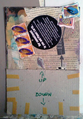
This overview shows the cover that Adrian taped on the collage (the collage measures 6-1/2 x 9-3/4 in.). Since I decided to continue with Adrian's “fishy” theme, I figured some fish stamps from South Africa and a recycled tag might come in handy.


The shot above shows how things looked after playing around with various arrangements and then gluing down the pieces.


I didn't know what was under the cardboard (I didn't peek, I promise!), but I did know that I wanted to send down some blue streaks, if nothing more than to make sure there was some unity between the sections of the collage. So I watered down some ink and, by flexing the cardboard and shaking the collage, was able to get some dripping action going. Because the ink is transparent, I figured it wouldn't obliterate anything that Adrian had glued beneath. I don't know if this broke Exquisite Corpse protocol, but I wound up dripping ink in three places.


And then it was done and it was time for the moment of truth!


When I saw this I was absolutely delighted! What fun! What serendiptiy! I loved how my verticals just so happened to complement Adrian's sword. I loved how the bird mask on Adrian's man worked with my theme of a predatory earth. (That big black tag is the earth, folks!) And I loved the watery ink drips.

Here is the finished piece. If you ever have occasion to participate in an Exquisite Corpse project, I say go for it! It's nerve-wracking to be sure, but there is something entirely magical in the moment when you reveal what lies waiting just beneath the surface.


And, again, as always, thanks for listening.
Related Posts Plugin for WordPress, Blogger...